

The all-white, safely neutral living room is having a reckoning. Designers and homeowners are painting walls, trim, ceilings, and even doors in the same saturated hue, wrapping a room in one deep colour and letting texture do the rest. It is a thrilling idea and a nerve-racking one, because paint is permanent and a colour that looked wonderful on a swatch can feel overwhelming on four walls. An advanced AI image generator lets you live in the room first.
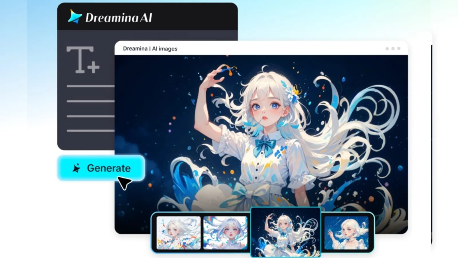
Dreamina, with its advanced image generation models, is a practical place to experiment. Seedream 5.5, Nano Banana, and GPT Image 2.5 are all there, so you can test the same room in a dozen colours without opening a tin. Here is how to plan a bold, color-drenched interior with confidence.
What colour drenching really means
Drenching is more than a feature wall. The same colour, or very close tints of it, covers walls, skirting boards, doors and sometimes the ceiling. The effect is cocooning and cohesive, and it makes furniture and art stand out against a single backdrop.
Choosing a hue that suits the room
Colour behaves differently depending on light and purpose:
- Deep green or teal for calm, library-like retreats
- Terracotta and clay for warm, sociable living spaces
- Midnight blue for dramatic bedrooms
- Butter yellow for sunny kitchens that feel optimistic
Light changes everything
A north-facing room makes saturated colours look cooler and deeper, while a south-facing room brings out warmth. Describing the room’s light in your prompt, “cool north light” or “low golden afternoon sun,” helps the generated image reflect how the colour might genuinely feel to live with.
Finishes and texture
Matte paint absorbs light and feels velvety, while a satin or lacquer finish bounces it around. Layering textures- bouclé, linen, polished wood, glazed ceramics- gives a monochrome room depth so it never feels flat.
Your 3-step colour test with Dreamina
Step 1: Write a text prompt
Navigate to Dreamina and write a detailed text prompt describing the room, the colour, the furniture, the finishes, and the light. You can also upload a reference photo of your actual room so Dreamina preserves its layout.
Example: A dining room with walls, trim, and ceiling drenched in rich terracotta, a round walnut table, cream linen chairs, a large abstract painting, matte finish, warm low afternoon sunlight through a tall window, bold contemporary interior photography.
Mentioning finish and light together makes the colour read as it would in real life.
Step 2: Adjust parameters and generate
Choose your model, Image 5.5 by Seedream 5.5, then set the aspect ratio, size, and resolution. Choose 1K for rapid colour comparisons and 2K for the version you plan to show a partner or client. Click Dreamina’s icon to generate.
Step 3: Customize and download
Refine the room with Dreamina’s AI customization options. Use inpaint to swap a rug or lamp, expand to reveal more of the space, remove to take out clutter, and retouch to balance the tones. When the colour feels right, click the Download icon to save it.
Dreamina’s image models for interior visualisation
Seedream 5.5, Dreamina’s latest and most advanced model, is excellent at interiors. Its deep reasoning generation understands how furniture, light and colour relate in a room, so proportions look believable. Multi-layer visual control separates walls, furniture, and décor, letting you swap a wall colour or sofa fabric in seconds, and pinpoint precision editing refines a single cushion or lamp. At 2K, paint finish and fabric weave remain convincing.
Nano Banana is ideal for rapidly cycling through palette options, and GPT Image 2.5 offers a different stylistic take on composition and mood. Using the three together inside Dreamina helps you compare a color scheme from several angles before committing to it.
Contrast through furniture and art
Against a drenched backdrop, a few well-chosen contrasting pieces pop. A pale sofa in a deep green room, or a brass lamp in a blue one, gives the eye somewhere to land. Keep the contrast intentional rather than scattered.
Styling the bold way
Bold rooms benefit from restraint in the accessories. Cluster objects in groups of three, use one large piece of art rather than many small frames, and let a single oversized plant or sculptural lamp act as the focal accessory.
Where bold interior visuals prove useful
This approach helps in several situations:
- Homeowners deciding between daring colours
- Interior designers presenting concepts to clients
- Property stylists preparing eye-catching listings
- Bloggers and creators building mood boards
Comparing colours before you buy paint
Generate the same room in three or four hues, keeping furniture and light constant. Lay the images side by side and notice which one you keep returning to. That emotional pull is a good signal, and it costs far less than repainting.
Final thoughts
A saturated room is a commitment, and seeing it first removes much of the risk. With an AI image generator powered by Dreamina, and models such as Seedream 5.5, Nano Banana, and GPT Image 2.5, you can try the boldest colour on your wish list in minutes.
Choose a hue that suits the light, layer texture, add careful contrast, and let Dreamina help you step into the room before you paint it.
